The Global Performance Dashboard is the most powerful field audit reporting tool in FranchiseBlast. The dashboard can compile thousands of audits into a single report. That said, you can only compile reports for the locations you have access to in FranchiseBlast. This means, if you’re the CEO, then you’ll have access to all locations in the franchise, and if you’re a business coach then you might only have access to the locations in your territory. If you're a franchisee, then you might only have access to the locations you own or manage.

Access Global Performance Report
To access the Global Performance report, select the Global Performance on the Field Audit main page to roll-up field audit data across multiple locations. This tab is to the right of the Franchisee Performance tab (you may need to scroll the tabs horizontally to see the Global Performance tab depending on which device you are using).
Now select a questionnaire and choose a version of the field audit from the dropdown menu. Once you select a version of the field audit, it will automatically combine all the data into a single report. Use the Data Filters and Heat Map to drill down into your audit results and identify areas of improvement.
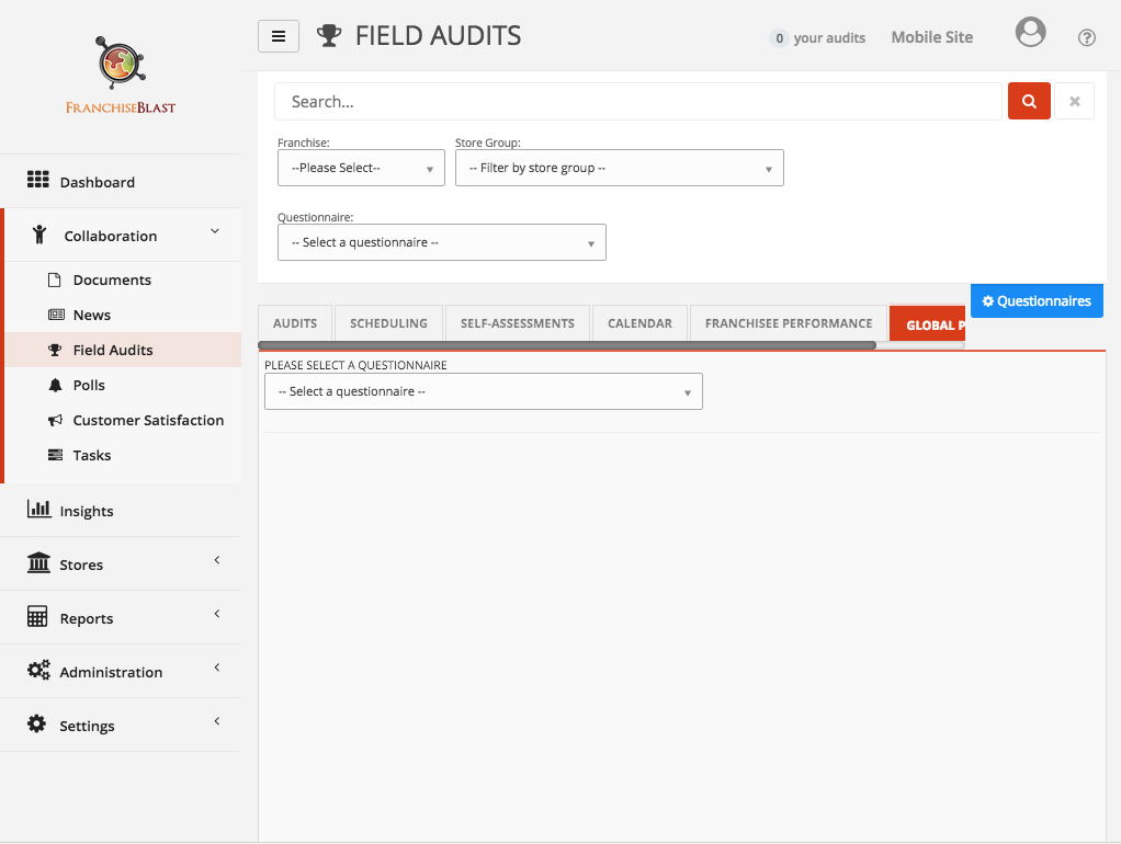
Select the “Global Performance” tab on the field audits main page:
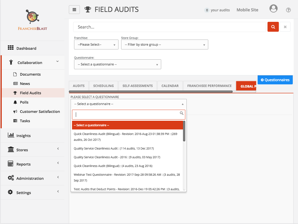
Select a questionnaire from the dropdown menu.
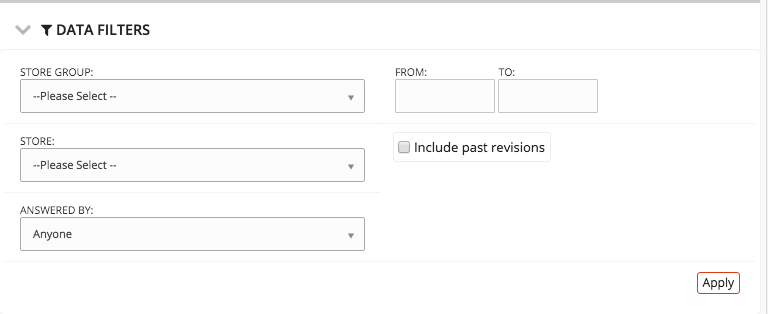
You can add filters using the Data Filters drop down menu. This allows you to filter by store, store group, auditor, date-range, ect.

Heat Map
If you scroll through the report you’ll see the response rate for each question. Select the arrow icon to drill into results by franchisee. This provides a great overview, but there’s a better way to quickly identify system-wide weaknesses. Once you've chosen the appropriate filters, hit the Apply button. The next thing you should notice on this page is the Heat Map feature.

Scroll back to the heat-map at the top of the page and hover your mouse over the top bar – it shows the system-wide average for this questionnaire. Hover your mouse over the bars below and you’ll see the averages for the sections, right down the averages for each question. The Heat Map is designed to be a quick and easy way for you to identify areas of improvement. Green sections are good. Yellow sections have room for improvement. Red sections need improvement.

The top row of the heat map is the average audit score of all the locations you have access to, filtered by the data filters.

The second row down shows the average section scores.

The bottom row contains the average score for each question.

There's a lot of information here so we added a function called “Filter by range”. Select the Filter by range checkbox and move the slider to see questions that scored below a certain threshold. In the example above, we're looking at just the questions that have below a 75% average. If we scroll down, the report is now more concise and allows us to identify areas that need the most improvement.

Select “Best to worst” to highlight the weakest questions for the stores you have access to.

To drill into the 5-10 weakest questions, select “Average %”, then select the “Filter by range” checkbox, and drag the filter until the heatmap shows less than 10 questions. For this report the threshold is 40%; this removes all questions from this report, except the ones that scored below 40% compliance. These are the areas where the locations need the most support.
We can now continue moving through the Heat Map, identifying areas of concern, and implementing solutions to improve these troubled areas.
Need more help?
Feel free to contact us with any questions.